Tuesday, July 31, 2007

Exhibition / Environmental Graphics


Looking at some different areas of graphic/communication design, I came across some work produced by design studio Graphic Thought Facility for various exhibitions. This is a really important area of visual communications as graphics for information, signage etc are all around us in our everyday environment. Designs for such a use have to be clear, informative and function quickly and simply yet the design and execution is equally important as it can really add to and enhance the ambience of an environment. I like the work of Graphic Thought Facility and thought their work offered some examples where the design, communication and environment work well together.

Plastic Bag Gallery


An interesting project I came across at The Photographer's Gallery in London recently involving the plastic bag. The gallery is collecting images of plastic bags from London and the surrounding areas, inviting people to submit their own photography of found plastic bags.

The concept both highlights society's habits of consuming, disposing and lack of recycling and see such a number of images, most nowhere near as artistic as those above, of plastic bags strewn across streets, in parks, on fences etc really highlighted our over-use of this everyday item. Furthermore, I found the gallery's approach to the project as a means by which to encourage participation and bring protography into everyday life interesting as it is a means by which the general public have a platform for expression. The collection is being shown until September 2nd at The Photographer's Gallery, London.

Braille League

Adverts for the Braille League, an association that helps people with visual disabilities integrate with society.


Advertising Agency: Factory DGB, Belgium
Art Director: Alison Anselot, Geert de Rocke

Set of print advertisements raising the awareness of communication with the blind and the use of braille; the line "Blind see what they hear. Help them to see more" emphasises the need for better written or spoken communication for visually impaired audiences. The images, created from the words that illustrate the sounds associated with each of the objects, offer a really strong concept - it communicates the idea blind people use their hearing as their 'sight' also and creates a striking visual. It did however, take me alittle time to decipher all the words, but I felt the idea of highlighting the fact that communication needs to be more detailed for visually impaired audiences worked well.

This campaign also raises the issue of designing for audiences with disabilities or impairments and offers a really interesting challenge - to produce communications that both function effectively and are suitable for the specific audience. Designers so often think visually, but thinking about the use of braille, engagement with senses other than sight, and advancements in technology, could provide starting points for some innovative, forward-thinking design.

Type In The Sky


I came across this on another online blog, a piece of visual artist Lisa Rienermann, that depicts the letters of the alphabet formed by the shapes buildings make against the sky when photographed from below.


She first came across the letter Q, in a courtyard in Barcelona, and since went on to complete the alphabet, presenting the visual collection in a box, shown below.


This is a great example how one image, idea or piece of inspiration can generate a whole project. The unique nature of these images and the visual interest they create for the viewer was what caught my attention to the project; I think there is potential within the project to push the concept much further, perhaps for some work based on one city/place and it illustrates just how inspiration and ideas can be found anywhere.

Sunday, July 29, 2007

Cancer Research UK: Tanker


Brief: To get under the radar of hardened smokers who block out health advice and opinion. They know that smoking is bad for them but, as with any addiction, they blind themselves to the effects on their own health and the health of others. As a result they are pretty immune to the standard ’smoking is bad for you’ advertising which they deem to be ‘preachy’. We needed to find a fresh approach which would surprise them before they had time to block out the message.

Solution: Very few smokers know that smoke from a cigarette is made up of over 4000 chemicals including hydrogen cyanide, formaldehyde and benzene. The idea was to make smokers reappraise the highly dangerous nature of these chemicals by placing them in public places together with the hazardous warning signs that have to accompany them by law. The shock of seeing such a large group of chemicals together in town centres was compounded when it was further revealed that they are actually all present in cigarette smoke.

Result: The main aim of the chemical tanker was to launch the campaign which it did extremely successfully. It also generated £75,000 of free publicity with lead stories on the Guardian Media’s website and further extensive coverage on the BBC online, ITV, BBC Radio 4 and BBC Radio Scotland plus other local stations. Awareness of the poisons in smoke rose by 178%. The website received 62,467 unique visitors in just 14 days with 124,682 page views. 85% of people believed cigarette smoke posed real dangers while 58% of smokers took action to give up.

Agency: Ogilvy, London, UK
Executive Creative Director: Malcolm Poynton
Creative Director: Colin Nimick
Art Director: Charlie Wilson
Copywriter: Emma de la Fosse
Account Manager: Jenny Bust
Account Director: Donna Buckingham
Business Partner: Georgie Stewart
Production Manager: Philip Melaney

An example of ambient media, whereby using/changing something an audience see on an almost daily basis, creates an attention-grabbing and memorable output for a communication message. The results (above) only indicate further how this generated free coverage and raised the profile/awareness of the campaign dramatically. On another note, the use of a tanker, associated with chemicals, toxins, things which arent good for us, couldnt have been more suited to a message communicating these exact ingredients that are in cigarettes.

Amnesty International

"Your petition is more powerful than you think"


Agency: TBWA\Paris, France
Executive Creative Director: Erik Vervroegen
Art Director: Nicolas Moreau
Copywriter: Nicolas Moreau
Account Supervisor: Guillaume Allilaire
Production Company: FESTEN FILMS, Paris
Director: Les Blin
Producer: Christian Delhaye

"Your signature is more powerful than you think"


Agency: TBWA\Paris, France
Executive Creative Director: Erik Vervroegen
Art Directors: Stephanie Thomasson, Stephane Gaubert
Copywriters: Stephane Gaubert, Stephanie Thomasson
Account Supervisor: Guillaume Allilaire
Production Company: MAGIC LAB, Montreuil
Director: Philippe Grammaticopoulos
Producer: Maxime Boiron

Two recent moving-image advertisements for Amnesty International. I found both of these pieces particularly memorable due to the unusual styles of image used and the clear, concise visualisations of the messages that were being communicated. I particularly liked "Signature" as I felt through the visual narratives, the link between putting your signature on a petition and directly helping to save lives was emphasised effectively.

TheFLOWmarket


TheFLOWmarket- I read about this a while ago and recently came across it again. TheFLOWmarket is a provocative 'shop'/exhibition space that both drives home it's point and visually, looks stunning. It is focused on sustainable growth, which it presents the parameters through three catagories: individual, collective and environmental flow, whilst it raises the issues of consumption, consumerism and our values through physical representation.

"It is a supermarket selling consumer awareness. TheFLOWmarket™ has isles, shelves and registers like any other supermarket. But the cans, cartons and bottles on the shelves are all empty. The project idea is purely metaphysical and so are the products for sale. Entering the shop you can buy things like "Clean air", "Commercial free space", "Consumption moderators", "Good vibes" and "Holistic thinking" dressed up as basic commodities in standard containers"

The project is completely metaphorical yet even by looking at the images of the exhibition/shop, you can begin to see how it makes you think about your priorities and question your values. It appealed to me both as it was a truely unique way by which the rising issues of consumerism and sustainable growth have been explored and visually, it is a well-executed, witty and impacting display of design. I particularly liked the copy of the products and some shown below. For a greater understanding of the project, visit the site - here.


Saturday, July 28, 2007

Amores Perros (Love's A Bitch) 2001


Amores Perros, the first film by director Alejandro Gonzalez Inarritu, who more recently produced Babel, is one of the best examples of today's Mexican film industry. Set in contemporary Mexico City, the film links three distinct separate narratives through the event of a car crash; the film begins with and evolves around the crash as each of the three 'chapters' explores the stories of the individual characters.

I found the film particularly interesting because it dealt with issues that were universal and those uniquely Mexican - the film could be set in any poor, over-populated urban environment whilst the issue of over one million homeless dogs was more unique to Mexico City and the film also explores ideological struggles from Brazil's past.

The film balances on the theme of relationships, whether these are between people and dogs, lovers, brothers, family or economic / political and the idea of living with decisions - the cruelty human beings impose on each other. This results in the film being violent and extremely graphic at times, some comparing the violence to that in Pulp Fiction; however personally, I felt the violence was painful and real in Amores Perros, it was one of the factors that impacted me most and was far from entertaining.

Amores Perros is built on an ambitious plot of overlapping lives, a cleverly structured narrative that holds your attention. Visually I found the film very powerful and the direction one of the strongest parts - Alejandro Gonzalez Inarritu has an incredible sense of detail and the down-to-earth grittiness, the almost continuous camera movements creates, certainly suits the themes and ideas explored.

SOS Mata Atlântica: Google Maps


An online advertisement I came across that has been used in America to highlight the growing problem of the decreasing forest areas in the US. I have posted it as I feel it is a good illustration of concept and chosen medium complimenting each other to communicate the strongest and most effective message the advertisement can. The interactive nature of this piece allows the audience to discover the message for themselves - personally I feel this makes for a more effective impact on the viewer.

To view it - click here

Photo Trouvée


Another inspiring book I have recently come across that seems to further highlight this trend of collations of 'found' photography from anonymous photographers. Photo trouvée collates 285 'found' photographs from a period of over twenty years by authors Michel Frizot and Cédric de Veigy; described as an 'anthology of the ordinary' it contains universal experiences and memories that any viewer can relate to. I particularly enjoyed the carefully arranged order the of photographs, in terms of the atmospheres and emotions they suggested/provoked, that enhanced the experience of the book.

Wednesday, July 25, 2007

The Napkin Project

Curartor Jacki Lang has been mentioned in various press several times due to her recent exhibition entitled 'The Napkin Project'. Lang has captured the absent-minded doodlings of over 30 creative people using an array of media and collated them into a quirky, fun exhibition that makes something of an otherwise disposed of piece of creativity.


This just really appealed to my fun side - it was great browsing through the illustrations and different responses from people. I liked the fact Lang had taken something so simple that we all do to pass time without even thinking about it and made something much more appealing and engaging.

Wallpaper* has a selection of the napkins exhibited - here

Visuelle

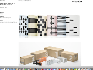
Visuelle - An online collection of examples of design from around the world I came across from another site. The archive is an excellent source of inspiration and a good place to browse work and follow external links to portfolios and studios of examples you like. A great place to keep visiting to view updated examples and new additions.


This archive is maintained by London-based This Studio whose own site is also worth a look.

Sustainable Design

Sustainable Design - A Conversation with Design Publishers


A video I found on a "green-design" blog discussing some of the issues surrounding sustainable design and the problems that we need to overcome. Not directly relevant to print-based design but raises some points that could perhaps considered when trying to produce environmentally-friendly design. The speakers come from Metropolis Magazine, treehugger.com and core77.com with Jill Fehrenbacher from Inhabitat - all relevant sources if you are interested in these issues.

Illustrator - Zara Wood

One of my favourite contemporary illustrators who now produces most of her work for fashion, editorials and advertising. I particularly like the unique stamp she has put on her work, identified by her fascination with using cardboard and the intriguing and mesmerizing qualities of her drawings. Her work is great to look at and even better seen in real-life.


Take a look at her site here.

It's great to see she has taken her illustrative style and carried it through her whole site although I think she may of gone alittle too far now and has taken some of the attention away from the individual pieces of work on display. All the same, it gives a great feeling for the work she produces.

Monday, July 23, 2007

Unseen Vogue

A great book someone gave me in work today as a source of reference for a project - Unseen Vogue: The Secret History of Fashion Photography.

The images collated in the book are all 'rejected' photographs from the magazine Vogue yet they provide a fantastic celebration of fashion photography over the past eighty years or so - a great source for inspiration and a collection of some of the earlier work from the likes of Cecil Beaton and Mario Testino . Anyone with an interest in fashion or photography would enjoy the book purely on the images themselves; however what I found particularly interesting was exploring these images that depicted photographic exploration that was too advanced for it's time - the photography becomes even more fascinating when you consider the context in which it was taken.

Sunday, July 22, 2007

DesignArt by Alex Coles

A really interesting book that explores the blurred and indistinctive boundaries between 'art' and 'design', coined 'designart' by it's author Alex Coles.


The book traces the concept of designart back from the early twentieth century to the present day with references to a wide selection of contemporary art and design. Apart from the exploration of this blurred relationship, the book is a fantastic source of reference and inspiration, written clearly and laid out well - one to buy and keep.

Dove - Evolution Viral

Viral ad for the Dove brand highlighting it's 'Campaign for Real Beauty' .

Interesting concept to promote the campaign and communicate a unique brand positioning for Dove. Although ironically it is effectively exploiting it's own industry, it clearly communicates the fact that the beauty industry and media present a very false image to us, the consumer - it's a clever eye-opener into what really happens 'behind the scenes' before you see the stereotypically beautiful, flawless face plastered on a billboard. It is extremely relevant to the current debates surrounding the effect of the media and what it presents as 'beautiful' on the younger generations of today and is trying to communicate the aim of it's campaign - to get girls and women to appreciate themselves for who they are and not to aspire to these images.

However, whilst exploiting the methods of the industry, it struck me the ad in a way also conforms to this stereotypical idea of beauty by acknowlodging the woman at the beginning as not 'beautiful'. Some of the brand's other ad's presenting normal girls and women could perhaps be argued to be more in line with the message the campaign is trying to communicate, none the less, this is still an effective attempt to deal with the issue surrounding the power the media's presentation of the ideal has on people. The repositioning of the Dove brand away from the rest of the beauty industry is a commendable attempt to respond to the negative impact of the industry yet I am sceptical as to how far it will succeed to make any real impact as in the end, people buy the products because they aspire to 'improve' themselves in some way.

Using Empty Space!

Found these ambient ad's for a chain of hotels from M&C Saatchi, Spain and found myself trying to think of other similar 'empty spaces' where an advertisement would be as effective as this. Sometimes you spend ten hours sitting in the same seat, looking at the same seat back with nothing on - the right idea with a successful execution could make advertising in this space really memorable. For this example, the idea works well, perhaps the illustrations could have been alittle better though.

Apple

Posted this as I just thought it was a great visual concept for selling the ipod product and itunes service. Its simple yet communicates perfectly the function/use of both product and service,. It has differentiated itself from the generic billboard ad creating a memorable and eye-catching advertisement.

HBO Voyeur Project

'The HBO Voyeur Project is a collection of multi-media stories that HBO has built around the theme of voyeurism.

See what people do when they think no one is Watching is the tagline that they have used to describe the experience that starts in the streets of New York City, behind the countless windows that we pass everyday. It comes together in a silent film that will be projected on the side of a building, and extends to the HBO channel, HBO on Demand, and online at HBOVoyeur.com. There are also “artifacts” of the characters everywhere, pieces of story which have been sprinkled around the web and in the real world to heighten the experience for those who like to get involved. However it is experienced in whichever medium, the point of the HBO Voyeur Project is to get the viewer to confront the uncomfortable question: “Do You Like To Watch?” ' (www.thestorygetsdeeper.com)

This is a US-based project that seems to of gathered abit of a cult-following and expanded from the original intentions of the producers. Interesting concept albeit alittle confusing and strange. Go to www.thestorygetsdeeper and www.hbovoyeur.com for more about the project

HBO Voyeur Project Trailer

FFFFound!

Ffffound! - Interesting site I came across that provides a service where users can post and share their images aswell as bookmarking their favourites others have posted. Worth a look through as there is some interesting, creative photography amongst the posts. The site could also be a great inspirational/visual research source - by adding or bookmarking images the site will recommend other similar images and you can begin to look through the posts of other users with similar types/subjects of images.

Saturday, July 21, 2007

Fernando & Humberto Campana

The portfolio site of two of Brazil's most famous furniture/industrial designers - Fernando & Humberto Campana

Another portfolio site that immerses the user in another world as they explore the site through creative navigation. I liked the visual feel of this site - it goes far beyond presenting a simple image of a piece of work, the use of collage and photography gives you a much more detailed insight into the unique attributes of each project and offers a far more engaging experience. Sound has also been used effectively to add to the atmosphere and experience of the site.

Matthew Mahon Photography

Matthew Mahon, US-based photographer whose personal portfolio site was recommended to me.

A great example of innovative navigation using Flash to create an engaging experience for the user. The site particularly appealed to me as I felt Mahon has used the medium successfully to both exhibit his photography and present himself and his personality - something alot of portfolio sites don't do. The interactive nature draws you in as you explore his own personal journey to become the photographer he is today, finding quirky comments and drawings on the backs of his photographs which make the site far more personal and successful than many other slick photography portfolios.

50 Short Films

At the end of June, the Los Angeles Film Festival screened 50 short films commissioned by the SOS campaign (part of Live Earth Day); the mission of SOS being, to provide a series of compelling and educational films, that are both inspiring and provocative and present the voices of a vast array of film producers. Alike to the music industry, this was intended to spark a reaction from the film industry and through film-makers responding to problems facing the environment, raise public awareness and initiate change.

The films range in style, tone of voice and execution, from comedy to serious, documentary to animation, but all address an issue in an a way that is personal to the individual film-maker. It's interesting to see how different well-known directors went about approaching an aspect of the subject. Most can be found on Youtube - 'Consumption' stuck in my memory for the way it was shot/directed as it isn't over complicated but simple and thought-provoking.

The films aren't all of a great standard or particularly creative, but the concept of using the power of film, especially at a platform such as a international film festival, to present a series of responses to the problems facing us today to the masses demonstrates how visual communications can be used to change habits and improve the world we live in.

Monday, July 16, 2007

The Fashion Museum


'The Museum of Costume' in Bath has recently been re-branded by a local consultancy Northbank. The new identity (shown above) was devised to reflect the newly named 'Fashion Museum' in a more positive light to younger generations. Furthermore, it was interesting to see how from the initial identity, the musuem has extended the re-branding far beyond the standard literature and stationary and used spot colours from the identity itself for flooring, walls and displays to harmonise the whole experience.

As for the identity itself, I can see the idea of visualising the idea of a collection of clothing from many different eras, fashions, designers and places through the use of the merging lines and the bright, fresh colours give a contemporary feel to the brand. However I'm still not so sure as to whether a fashion museum could be better represented - I guess perhaps the lines also link to the use of threads evident in all the clothing within the musuem. It's a hard task to reflect in an identity, such an organisation as a museum where there are so many aspects you'd like to represent and so perhaps in this case, some simple typography may of suited? Yet, I can sympathise with the need to also appeal to the younger generations in order to re-ignite interest in the musuem.

And for anyone near Bath who hasn't visited, this is a great place to go if you've got an interest in fashion and fashion history with some fantastic collections from designers past and present.

Mathieu Hubert


French-born graphic designer/photographer/illustrator, Mathieu Hubert, has produced some of the most inspiring work I have seen recently. I particularly like his style of photography and his site contains some nice bits of design. Well worth a browse.

www.mathieuhubert.com

Sunday, July 15, 2007

Mark Porter Design

For anyone with a strong interest in graphic, particularly editorial design, a designer I feel is particularly important to be aware of. Porter was responsible for the successful overhall of the Guardian's design in '05 and has also worked for Colors and Direction magazines. His work for the Guardian is particularly influential in directing the future of contemporary newspaper design. His portfolio demonstrates some good examples of successful layouts / typography aswell as spreads from the Guardian re-design.

www.markporter.com

Pictures of Walls


A fascinating site I came across containing a collection of images, some of walls, from around the world. I liked flicking through the albums, seeing how a few words made something uninteresting, interesting and intriguing. I also found the idea of anonymity interesting - you have no idea who created/wrote each piece, yet in some cases, you can begin to imagine their personality or and interest/issue particularly close to them.

Worth a look if you enjoy this kind of witty environmental/urban art.

www.picturesofwalls.com

Turning The Place Over...


Richard Wilson is one of Britain's most renowned sculptures, famous for his work that intervenes with architectural spaces with inspiration from the worlds of engineering and construction. Turning The Place Over is his latest installation in an unused building in Liverpool City centre, involving an 8ft egg shape cut from the building facade being rotated, giving the audience a glimpse of the interior.

It has received many reviews and much discussion, being labelled by some as the most daring piece of public art commissioned in the UK by some whilst others argue is it even art at all. Visually the installation is impacting - from far away it disorientates you as it is hard to see how part of a building is continuously rotating whilst up close it is fascinating as you watch part of a building front rotate above you.

After seeing his installation 20:50 (Saatchi Collection) , a room filled with recycled oil and being inspired by his approach to changing architectural spaces and altering people's perspectives, I was intrigued to see Turning The Place Over. In real, it is better than I had expected and fascinating when you stand underneath the moving cut-out. The installation has completely changed this old Yates' building in Liverpool and Wilson has explored the interior and exterior architectural spaces in a truely unique way.

Is Packaging Rubbish?

Mark Constantine, the businessman and environmentalist who, amongst other things, set up the bath and beauty product company Lush, whose products are all delivered to the consumer unwrapped, presented an interesting programme on Channel 4 recently titled Packaging Is Rubbish.

The programme calls for a consumer campaign against the excessive packaging that covers, protects and decorates almost everything that we buy. Constantine raised some interesting points, highlighting that 98% of manufacturers and retailers need to do more to reduce excessive packaging waste and that often, the packaging costs three times as much as the product it is protecting/decorating. New trends in consumer research are beginning to indicate people are starting to become concerned as to the amount of un-recyclable rubbish they throw away each year, yet whilst there are some companies making an effort to reduce packaging, we are seeing a packaging explosion - pre-sliced, plastic wrapped apples to individual ketchup sachets, were two highlighted on the programme

The programme was primarily an appeal to the mass consumer market - the general public, and although it made me think as a consumer how guilty I was of falling for seductive packaging, it also made me question the role of the designer. Although the programme didn't mention the designer of the packaging directly, it is clear that if designers were made more aware of the materials and methods of production they employed, a lot could be done to reduce the impact of our packaging-obsessed culture. It shouldn't been seen as a restriction, but rather a creative problem whereby packaging designers should begin to explore new ways of packaging products that still protect, attract attention and create desire but that don't impact our planet in such a negative way.

You should still be able to catch the programme online at Channel 4 and it would be interesting to hear peoples thoughts on these issues as producing recyclable design may be something we will engage in during our career.

Friday, July 13, 2007

Ambient Media


Two examples of innovative business cards that have used a visual technique to make a reference to the service being provided, making the cards memorable to the receiver. Simple yet witty and perfectly suited to their purpose.

Unexpected Photography

File Magazine

The site publishes photographs that treat subjects in unusual ways, from photographers around the world. Worth a browse if you're interested in contemporary photography and a good way to pick up on new photographers you like.

www.filemagazine.com

Paul Chan - The 7 Lights


In recent years, Chinese artist Paul Chan's digital and video work has become well-known around the globe. His recently exhibited installation The 7 Lights offers a creative use of light and shadow and like all of his previous work is full of references to our world today.

Each animation is fascinating to watch and as the colours subtley change and bounce off the walls, abstract glowing shapes and shadows are cast around the gallery room. Chan began constructing the shadows using black sugar paper shapes then animating them, but I was inspired as to how something so simple, using the simplest of materials - light and paper, could create such a contemplative effect.

Furthermore, the ideas and references behind Chan's work and his explanations as to why he chose the shapes and objects used and what they mean, makes this a truely fascinating piece of work. Each of the seven installations become increasingly abstract, towards the final installation - the 7th, which has yet to be realised.

'Friendly Fire' - Jonathan Barnbrook


Friendly Fire - a retrospective of the career of graphic designer Jonathan Barnbrook. Known for pioneering design with a social conscious, the exhibition stretches from Barnbrook's early experimentations to recent work with the anti-corporate magazine Adbusters and that of his studio, Barnbrook Design - including some pioneering typefaces from over the last two decades. The studio is notable for it's belief that design can faciliate social change and generate discussion. The exhibition demonstrates the importance of design as a 'voice' within society and the success of Barnbrook's work illustrates how design has become a culturally valid form of expression. The work on display is innovative whilst deeply thought-provoking and a great chance to see the work of a leading designer of today.

The book Barnbrook Bible: The Graphic Design of Jonathan Barnbrook contains both his well-known and some unpublished works and offers a fascinating insight into the thought processes surrounding his work and well worth a read if his work, approach and beliefs appeal.

Thursday, July 12, 2007

Oia, Santorini and Nikos Rigopoulos


This small village on the north coast of Santorini was one of the most enchanting and atmospheric places I have visited and it was here I came across photographer Nikos Rigopoulos. The area is traditionally known as a artists and photographers heaven with endless galleries selling paintings, prints, photographs and collages of the recognisable white and blue town. Yet the work of Rigopoulos stood out as a fresh approach to this beautiful subject - his work encaptures the unique, tranquil atmosphere of the small village whilst presenting it with an area of mystery and intrigue. Unlike the majority of work from photographers here, his work is, in majority, black and white. His work can be searched for on the Internet.